top of page


"Inked" Magazine Spread


I conceptualized this Inked magazine spread featuring real-life tattoo artist Sebastian Velez, a 22-year old who works in Greenville, South Carolina. I used a high-key image for the cover to represent the edgy feel of the magazine. The left page shows a collection of images that I took while the artist was working on a client. The right page gives a background of Sebastian's history as a tattoo artist, and there is a QR code to the documentary I made about him which gives the audience a more in-depth look at his story.
UofSC Campus Hotspots Infographic
.jpg)
This infographic shows various hotspots across the University of South Carolina campus. My intent for this visual map is to show incoming freshmen local attractions and venues, where to grab a bite to eat, and where to get some exercise while on campus. My graphic won the class prize to be published on Garnet and Black Magazine's website during the first week of fall '22 classes.
UX/UI App Design
SIGN UP / LOG IN
CLIENT PROFILE
MOOD BOARDS

VIEW IMAGE
BROWSE
CONFIRM DEPOSIT

Storybook Photo is an app I conceptualized that is aimed at people searching for wedding photographers. These are six screens that I mocked up to show some sample functions of the app.

The interaction map I created for my "Storybook Photo" app shows the potential pathways that users can take throughout the app. The arrows show what screen the user will be directed to based upon the button they choose.

The site map uses visual hierarchy to expand upon three different functions of the app: profile, browse, and pay deposit. The arrows show how the user will navigate through these three functions, starting with the splash screen.
Social Media Campaign
The objective of my Beautycounter social media campaign is to appeal to their audience in a visually stimulating way that will entice consumers to purchase cleaner and safer beauty products that are better for the body and planet.

I styled and shot the products to be consistent with Beautycounter's brand and style, which I referenced from their website and social media accounts. In this campaign, the target consumer will see a personalized advertisement on their Instagram feed, which will compel them to visit Beautycounter's website and potentially buy the featured products.
Logo Redesign


This is a proposed rebranding I did for a local small business that specializes in fitness equipment installation and maintenance. The old logo was dated and confusing, so I updated and simplified it by using the initials of the company while adding in a dumbbell in the negative space of the "S."

Stickers would be useful for the company because they could put them on the equipment that they fix and install. This would be especially effective when they stick them on machines they install and service in busy gyms.
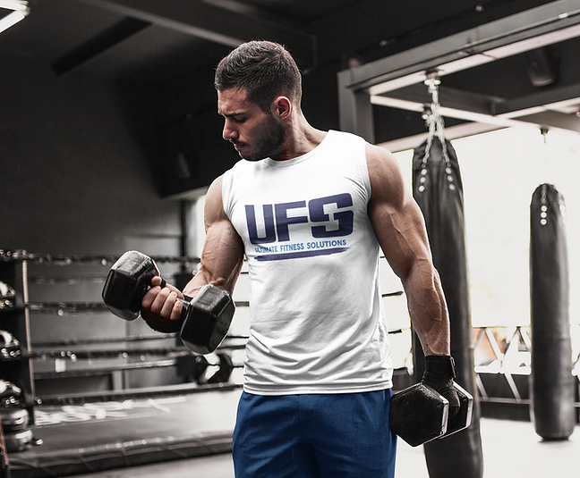
UFS could put their new logo on T-shirts that could be worn by staff and sponsored by influencers in the local athletic community, such as personal trainers. This would spread the word about the company and generate new clients for the business.

This mockup shows what the updated logo would look like if it was wrapped onto one of the company's vans. Since UFS delivers equipment to customers all over the southeast, having the new logo on their vehicles would serve as free advertising everywhere they travel.
Packaging Design
This is a packaging design I created for an organization called "Ministry of Hope." They primarily help make positive changes in the lives of over two million Malawian orphans, many of whom suffer from AIDS. I wanted to make a low-cost packaging option to distribute these handmade bracelets, which are sold to raise money for the organization.

Here, the package is shown folded up. I used a sewing needle to thread string through the vertexes of the triangles to close the package all the way.

These four cards fit at the bottom of the package underneath the bracelet. They tell the consumer more about Ministry of Hope's mission, along with some information about the bracelet and the country itself.

When the customer opens the package, they will first see the bracelet. Under that, they can take the four cards out to read more information about the story behind the organization and the origin of the bracelet.
bottom of page